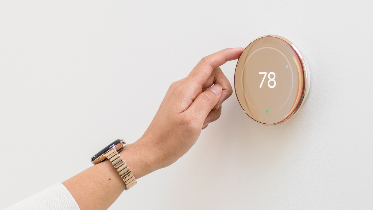
The launch of the original Nest Learning Thermostat was a big moment in the smart home industry. At the time, Nest was a fledgling startup founded by Apple engineers Tony Fadell and Matt Rogers. Sure, the device had handy smart features that allowed it to learn your preferences and adapt accordingly. But arguably the most important thing about it was the fact that it was a thermostat that actually looked nice.

At the time, and frankly still today, thermostats were generally ugly – white rectangles with dated designs and cheap-feeling buttons. Nest flipped that concept on its head, building a device that was easy to use and looked modern and sleek.

Polished Gold
Now, the Google-owned Nest is pushing forward once again and, at least from a design perspective, has launched what could be the most important Nest Learning Thermostat release since the original. The new device has a slimmer polished metal ring reminiscent of the Google Pixel Watch (that’s on purpose), a larger borderless display, and comes in three colors: Polished Silver, Polished Gold, and Polished Obsidian. Oh yeah, it also supports Matter, the universal smart home standard that will allow it to work outside of Google Home. That’s right – Apple users finally have access to a premium-looking thermostat with high-end features. The new, 4th gen device is available right now for $279, and ships with an external sensor for remote temperature monitoring.

Polished Silver
To get a deeper look at the design of the new Nest Learning Thermostat, and how the design team at Nest approaches design in general, I had the opportunity to ask Isabelle Olsson, Design Director for Home, Wearables, and CMF across all Google Hardware at Google, a few questions.
Design Milk: Nest has always been a design forward company. What are changes in design a reflection of? Changes in design preferences, how design and functionality are related, or something else?
Isabelle Olsson: First of all, we wanted to make sure we carried forth what people loved about the original design, such as the sleek round form, the satisfying rotating stainless steel bangle, and the engaging UI. With the redesign we had the opportunity to make the screen larger for better usability and make further enhancements to the overall experience, interaction, and look & feel, in addition to delivering improved technology and more powerful AI models that can work with a wider range of homes.
To continue the legacy of this groundbreaking design of the original Nest Thermostat we saw an opportunity to bring this product forward to the next decade by completely eliminating the appearance of bezels. We created a design that is seamless between the rotating stainless steel bangle and the lens from a curvature perspective. Additionally this effect is enhanced by our development of a mirror-film technology, resulting in the appearance of one cohesive material.

Polished Obsidian
DM: How did Nest balance design and functionality for the latest thermostat?
IO: We always strive to ensure aesthetics and functionality go hand in hand. An example of that is how we changed the form to ‘float’ off the wall, not only does it make the product appear thinner and more effortless, it also improves the interaction of turning the dial for various hand sizes, you can now rotate it with just one finger while leaving the screen unobstructed.

DM: How does the functionality of a device like the Nest limit design choices? How does it enhance them?
One of our design philosophies is to ‘turn challenges into opportunities,’ it’s an exciting job for us to take difficult requirements into account. It’s a fun process working closely with our engineering partners in landing solutions that serve our customers. In an ideal world, the end result appears to be effortless, in reality getting there is countless hours of meticulous focus in ensuring every step of the user journey is considered.
In this generation we are excited that we were able to leverage the Soli radar-based sensing technology – which functions through the display – to detect when you were nearby. The team used the same technology for the new Nest Learning Thermostat, allowing us to completely remove the plastic cutout, further enhancing the seamless appearance.

DM: In what ways do you see the design of smart home devices like the Nest thermostat changing over the coming years?
We strive to design for the long-term, hopefully more and more of our technology in our lives are designed to adapt to us, versus the other way around. We hope that people will love to keep the latest Nest thermostat in their homes for the next decade. In terms of what’s next, we are excited to surprise and delight you :).
For more information or to purchase the Nest Learning Thermostat (4th gen), visit store.google.com.

