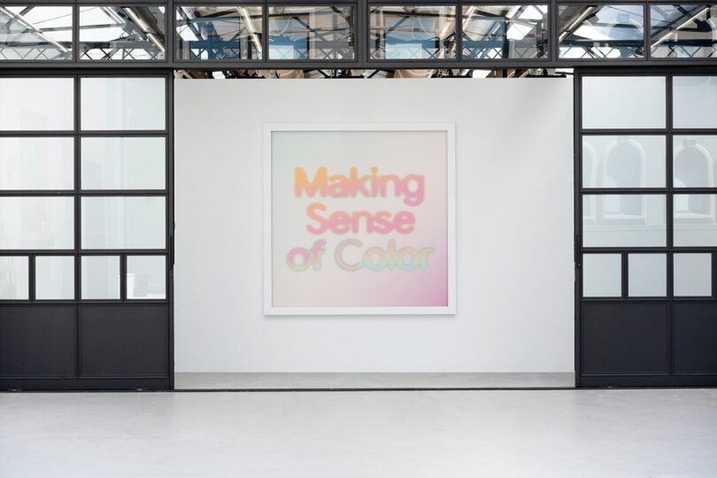
It may come as a surprise, but the human experiences of taste, hearing, smell, touch, and sight, share the computing capacity of technologies like the pocket calculator, hard disk, USB Key, and computer network, respectively. Google Hardware Design Studio, in collaboration with arts and research lab Chromasonic, explores the bandwidth of those sensory perceptions with their Milan Design Week 2024 exhibition Making Sense of Color. And to bring subsequent aspects of this supersaturated fantasia to fruition, the technology giant tapped Amplify, a global creative agency whose specialty is realizing brand experiences informed by community connection. While the physical element is temporary, together, all parties reveal the potential of spaces designed to satisfy not only technical parameters, ergonomics, and comfort, but also the relative indices of emotion and well-being – a neuro-architecture with inherent humanity.

In an advancement of their 2023 endeavor, Shaped by Water, Google continues its discourse on neuroaesthetics trading form for color wherein hue takes the lead, bolstered by the other senses. Sprawling across roughly 6,500 square feet inside a redeveloped industrial building near Porta Venezia – a particularly artistic district of Milan, Italy – the five-room, multi-layered installations unfurl. “We want to make sure that we give our guests an embodied experience. It gets you out of your cognitive mind,” says Ivy Ross, Google’s vice president of hardware design and co-creator of the exhibition. “Because you’ve never experienced something like this before, in terms of answering the questions of what does color sound like. And as you walk through the experience, what does color feel like? Taste like?”
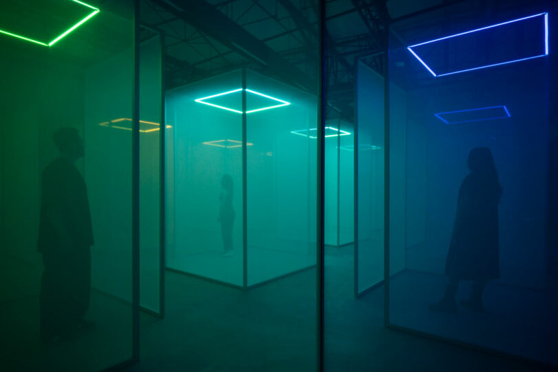
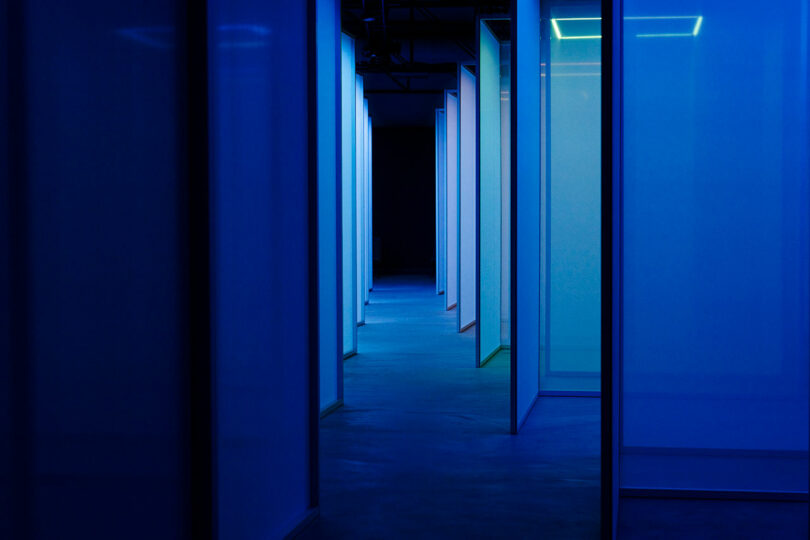
Inquiring minds encounter Chromasonic’s series of 21 nodes comprising semi-transparent scrims illuminated by square LED light bars suspended above as audible frequencies equivalent to the light’s wavelength emanate from 24 localized, sources of sound algorithmically linked. From the low rumbles of red moving through yellow then green to blue, soundwaves change in progressive tonality representative of shifting display as pitch gets higher, challenging listeners to hear color. This initial immersion sets the tone for a sensorial journey that subverts the typical understanding of sensory correlation. And, it allows for individuals to tune into the collective as subtle body movements affect greater context creating a sonic symphony.
The exhibit experience shifts from the intangible and ethereal to the tangible and physical as visitors make their way through a series of four adjacent spaces dedicated to a particular color inspired and informed by a specific sensation. Leaning into isomorphic correspondence – each subsequent narrative is driven by preconceived notions about particular pigments. “Our work is in tune and in harmony with what Chromasonic envisioned for their room, and what Google’s ambition is for the rooms,” says Ben Peckett, group creative director at Amplify. “The sensorial connection through those other elements starts to reconnect to human emotions.”


Following the audio-visual exercise comes a challenge to interpret color through feel as stones varying in texture and shape are presented. Grazing the lengthy display table with eyes closed, participants must use their memory to identify texture, shape, and even porosity, as they imagine earthy neutrals and the elements in nature that are considered grounding.
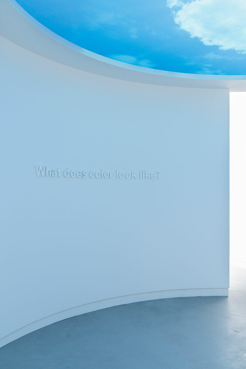
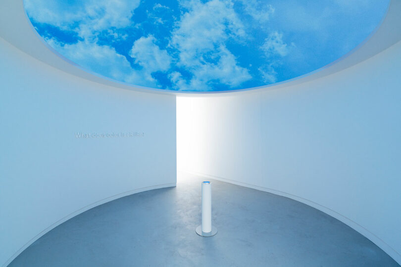
Sight is isolated moving forward as an elliptical screen suspended above displays a quintessential blue sky decorated with clouds and dotted with birds. However, onlookers are made to see through refraction and the multiplication of image as rendered in water pooling on the surface of a central silver-plated pole.

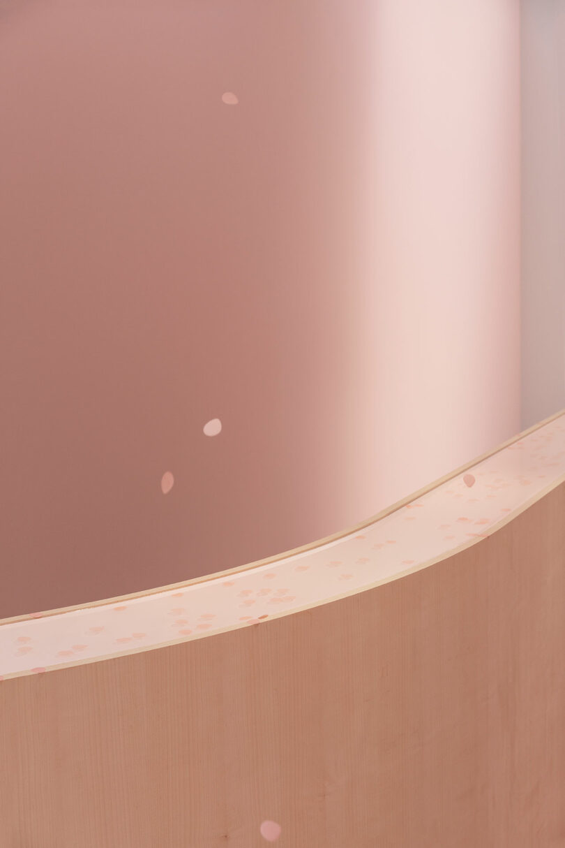
Enticing to smell, the aroma of roses in bloom conspires with the thought of blushing flowers to enchant visitors onward. Like petals plucked from their stem, unscented recycled pink paper pieces dance through the atmosphere as they descend onto a curved wooden platform. The soothing floral fragrance hangs in the air long after they settle.
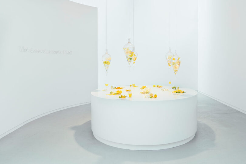
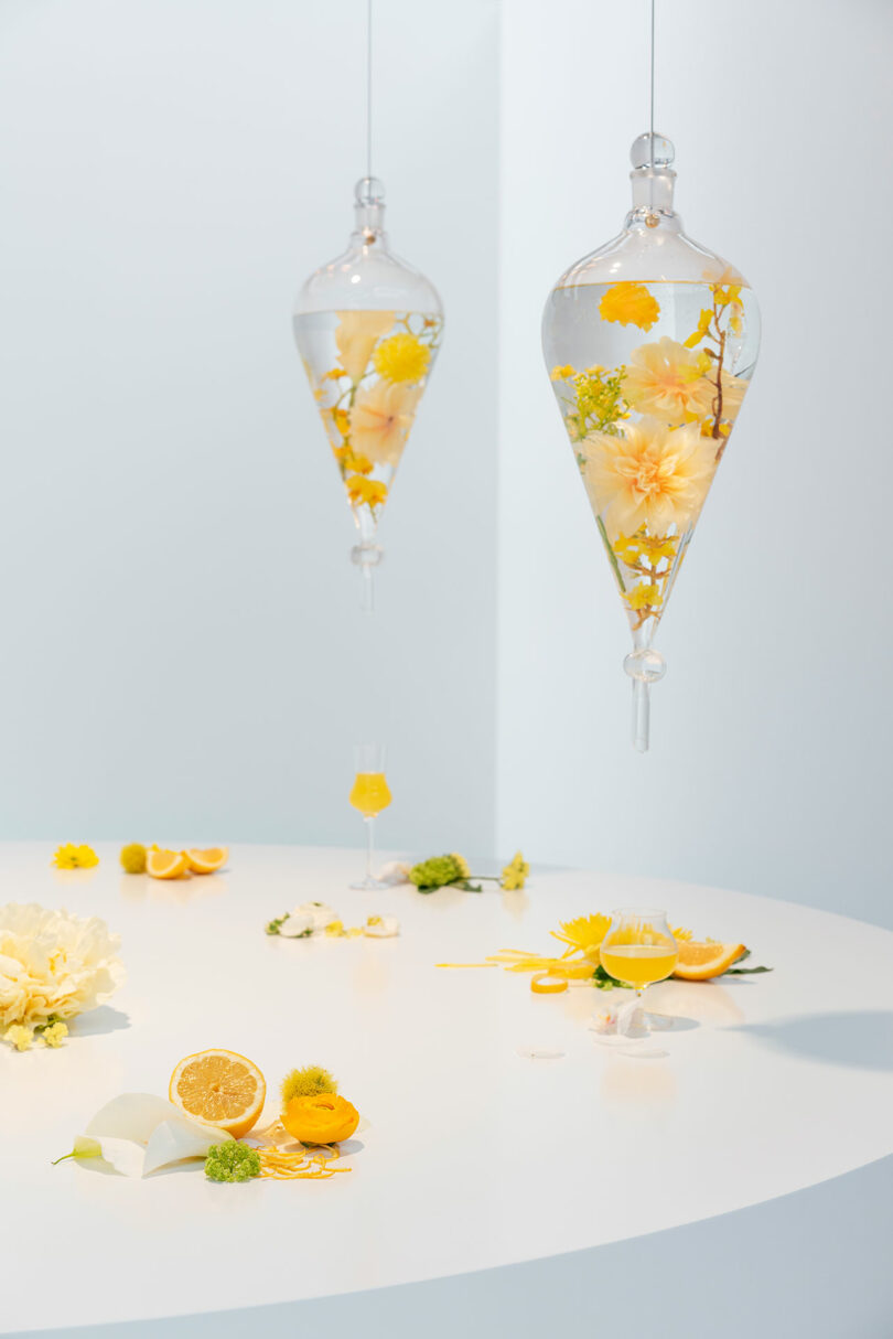
The following installment appeals to taste in a vibrant feast, which taps into the word “bright” – a culinary term that applies to a dish’s color and flavor profile. Seemingly sweet, flower-steeped, water-filled pendulums hang over a dining table displaying yellow-tinged elements laced with memories of orange juice served at breakfast alongside summer time sweet teas garnished with lemon.
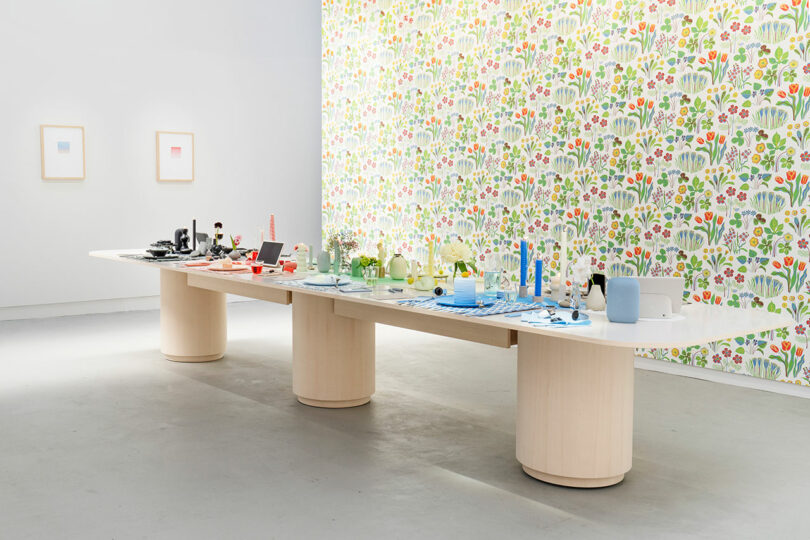
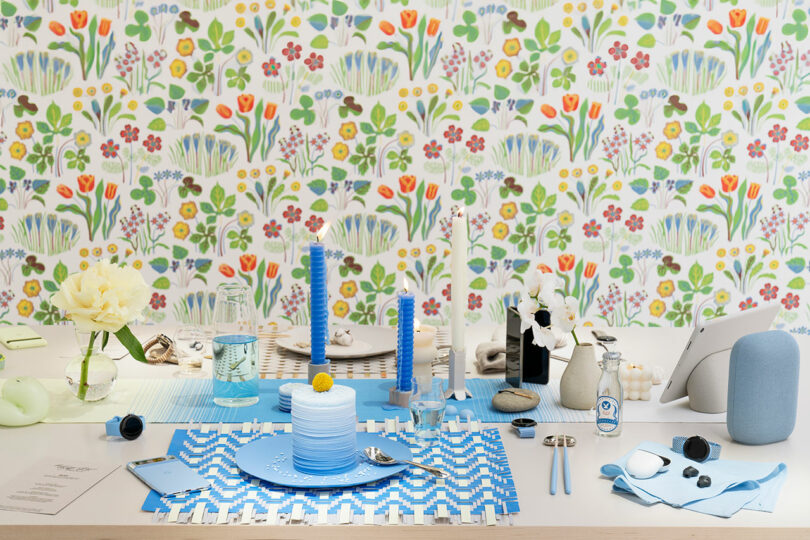
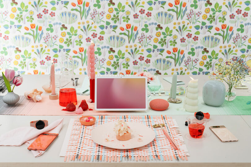
The final experience is a kaleidoscopic orchestration of design from Google’s hardware portfolio intermixed with other set dressings typical of tabletop objects, personal items, and home goods. More than a showcase, this final display is a testament to practicing empathy in real time and the meaning designers imbue on products once they’ve made sense of color. While utility will always be of concern it mustn’t overshadow seemingly aesthetic value. “We tend to sometimes overlook that because it’s always about what it can do for us, but how does it make us feel when we look at it or when we touch it,” posits Ross of consumer culture. “We [as designers] should consider how it makes people feel.”
To learn more about all the talents involved with the exhibition visit design.google, chromasonic.com, and weareamplify.com.
Photography by Edoardo Delille & Giulia Piermartiri.